

Contact Form 7 styling can improve the clarity and consistency of your forms. This guide covers scoped CSS, labels, responsive fields and visual styling tools.
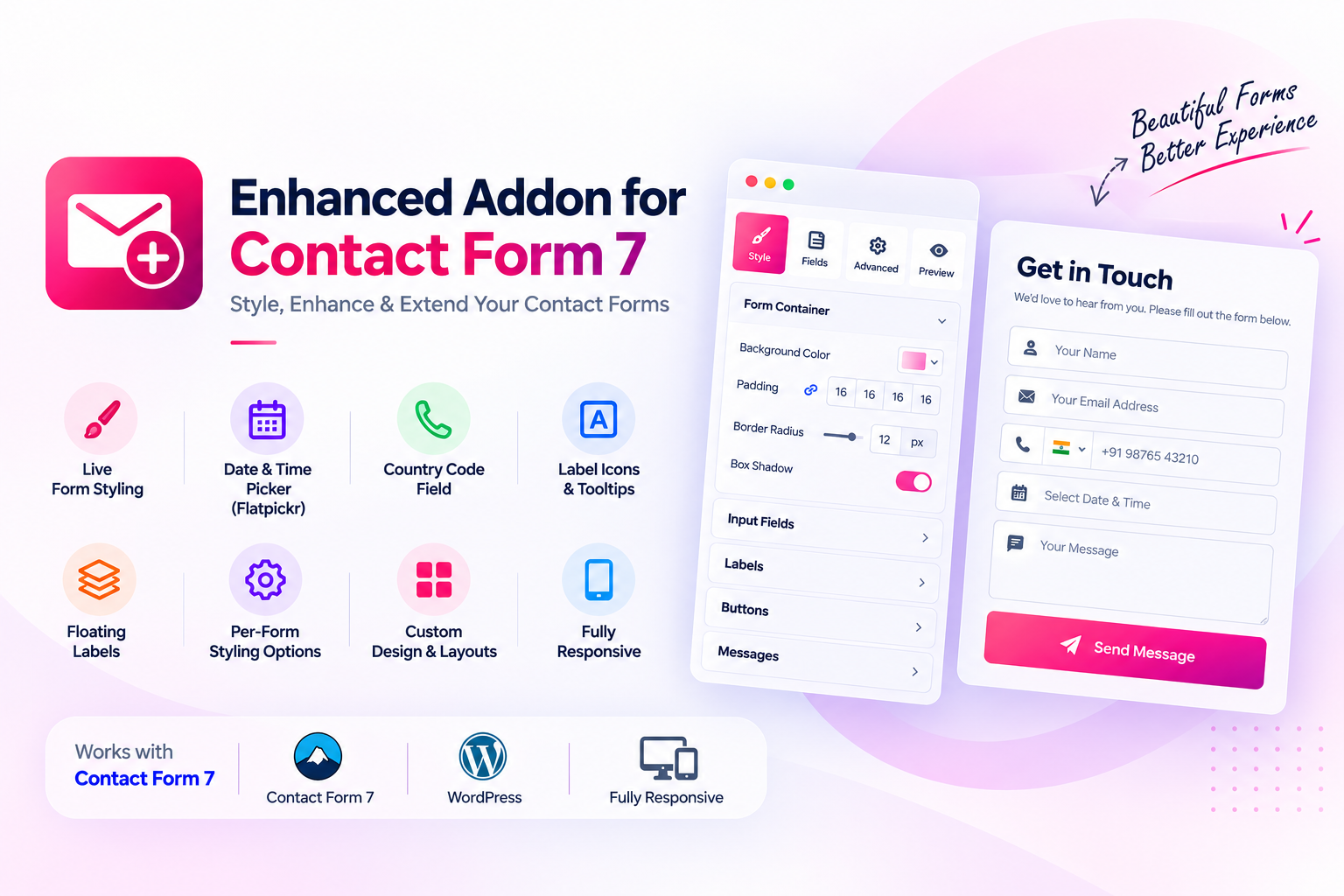
Contact Form 7 styling
Good Contact Form 7 styling should make labels, fields, validation messages and buttons easier to understand. Test the design on desktop and mobile, and keep keyboard focus visible.
Contact Form 7 makes it possible to create forms in WordPress, but the default appearance may not match the design of your website. A form can be functional and still look inconsistent with your theme, landing page or brand.
Learning how to style Contact Form 7 helps you create forms that are easier to read, more consistent and more comfortable to use on mobile devices. You can customize forms with CSS, or use a compatible visual addon when you want to work with design controls and previews.
Why customize Contact Form 7 forms?
Form design affects more than appearance. Clear labels help visitors understand what to enter, consistent spacing makes forms easier to scan, and visible focus states help keyboard users understand where they are typing.
- Make form fields consistent with your website’s typography and colors.
- Improve spacing between labels, inputs and validation messages.
- Make submit buttons easier to identify.
- Keep layouts usable on smaller screens.
- Provide extra instructions without filling the form with long paragraphs.
Method 1: Style Contact Form 7 with CSS
Contact Form 7 outputs recognizable CSS classes for its form wrapper, fields and response messages. You can use these selectors to customize the appearance without editing the plugin’s core files.
Where to add custom CSS
For a small site-wide adjustment, use the WordPress theme’s Additional CSS area if your theme provides it. For project-specific styling, a child theme stylesheet or a dedicated custom CSS workflow is usually easier to maintain.
Always scope your selectors to the Contact Form 7 wrapper or a specific form class. Avoid broad selectors such as input or label on their own, because they may change search fields, login forms or other plugin interfaces.
Example: basic field styling
.wpcf7 form input[type="text"],
.wpcf7 form input[type="email"],
.wpcf7 form input[type="tel"],
.wpcf7 form textarea,
.wpcf7 form select {
  width: 100%;
  box-sizing: border-box;
  padding: 12px 14px;
  border: 1px solid #d5d9e0;
  border-radius: 6px;
  font: inherit;
}

.wpcf7 form input:focus,
.wpcf7 form textarea:focus,
.wpcf7 form select:focus {
  outline: 2px solid currentColor;
  outline-offset: 2px;
}
This is a starting point, not a complete theme. Review the result against your own colors, contrast requirements and layout.
Method 2: Use a visual styling addon
If you prefer not to maintain CSS for every form, a compatible Contact Form 7 styling addon can provide a more visual way to customize the form. Enhanced Addon for Contact Form 7 by Dragwyb includes form styling controls and a live preview, so you can review the design while editing.
Its supported design-related features include:
- Form styling: Customize the form’s visual presentation.
- Live preview: See design changes while editing.
- Floating labels: Use a modern label interaction for supported fields.
- Label tooltips: Add supplementary explanations to field labels.
- Country code support: Improve phone-number entry for visitors using international calling codes.
Learn more through the Dragwyb product page.
Improve labels and field instructions
Use clear labels
Every field should have a clear purpose. Use concise labels such as Name, Work email or Phone number. Do not rely on placeholder text as the only label because placeholders disappear when visitors type.
Use floating labels carefully
Floating labels can save visual space, but they must remain readable when a field is empty, focused, filled or invalid. Test long labels and translated text to make sure they do not overlap the input value.
Add tooltips only when they help
Tooltips are useful for explaining unusual fields, formatting rules or why information is needed. Keep essential instructions visible in the form itself; do not hide critical information exclusively in a tooltip.
Make the form responsive
Check the form at desktop, tablet and mobile widths. Fields should fit their containers, labels should wrap naturally, and buttons should remain easy to tap. Avoid fixed widths that cause horizontal scrolling on small screens.
Accessibility and usability checklist
- Each input has a programmatic label.
- Required fields are clearly identified.
- Keyboard focus is visible.
- Error messages explain how to correct the problem.
- Text and controls have sufficient contrast.
- Tooltips can be accessed with a keyboard and are not the only place for essential instructions.
- The form can be completed on a narrow mobile screen.
Common Contact Form 7 styling problems
Theme styles override your CSS
Inspect the field in your browser’s developer tools and check which CSS rule wins. Use a more specific, scoped selector rather than adding !important everywhere.
Styles affect every form on the website
Scope custom rules to the Contact Form 7 wrapper or a class assigned to the specific form. Test pages that contain multiple forms.
Fields look correct on desktop but break on mobile
Remove unnecessary fixed widths, use responsive layout rules and test long labels, validation messages and the submit button on a real mobile viewport.
Contact Form 7 styling review checklist
After applying CSS or a visual styling addon, review the entire form rather than judging only the default input state. Theme styles, validation messages and long field labels can expose layout problems that are not visible in a quick preview.
- Scope custom selectors to the relevant Contact Form 7 form or wrapper.
- Check text, email, telephone, select and textarea fields.
- Keep labels and required-field indicators easy to distinguish.
- Provide visible focus and clear error states.
- Check button spacing, hover states and tap targets.
- Test narrow screens and browser zoom for horizontal overflow.
Prefer maintainable selectors over broad rules that affect every input on the website. After theme or plugin updates, test important forms again because generated markup and inherited styles can change. A consistent form should remain readable and usable even when validation messages or longer visitor input appear.
Final thoughts
You can style Contact Form 7 with CSS when you want direct control, or use a visual addon when you prefer to work with design options and a live preview. Whichever method you choose, prioritize clear labels, readable fields, responsive layouts and accessible feedback.
For a visual workflow with form styling, floating labels, label tooltips, country code support and live preview, explore Enhanced Addon for Contact Form 7 by Dragwyb.
Related plugin and official documentation
For additional form capabilities, see Enhanced Addon for Contact Form 7 and its official WordPress.org plugin listing.
For the underlying platform guidance, consult the Contact Form 7 styling documentation.
